Dr. Sarah Tonks, the founder of The Lovely Clinic, is one of Britain’s leading medical aesthetics practitioners – sought-after for her skill, subtlety, and a finger constantly on the pulse of new developments in medicine, beauty and 360° wellbeing.
With an impressive 20,000+ procedures under her belt, Dr. Tonks is a proud advocate for the transformative power of medical aesthetic treatments to reach or rebuild inner confidence alongside external beauty: “While some people are seeking a pep-up, or perhaps a look that gives them a point of differentiation, many of our patients come to us at a pivotal moment in their lives when they’re keen to make a physical change that reflects an important emotional shift. We see it as helping people to re-establish themselves.”
Creative Director, Jay Flaxman, “Central to the strategy was the Core Proposition: ‘Real Confidence, From Every Angle”. In an unregulated industry, a clinic that was founded and run by Doctors, with the relevant certifications, is something we felt we had not only the right to shout about, but the responsibility.
Confidence is a result of trust. Poor practice is a problem for the aesthetics industry worldwide, but one of the key challenges lies in the fact that it shows up in many guises. Grey or illegal clinics are a concern in many countries, as unscrupulous businesses post fake qualifications and offer bootleg fillers or use counterfeit devices for treatments. In the UK for instance, it is possible to undergo a brief unregistered training course before practising as an injector.
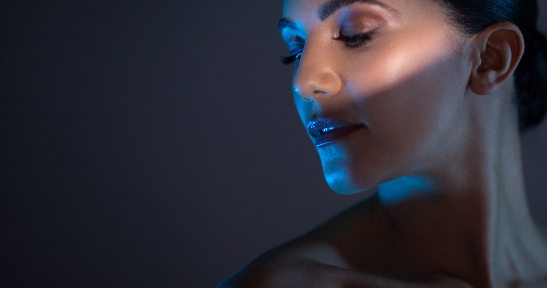
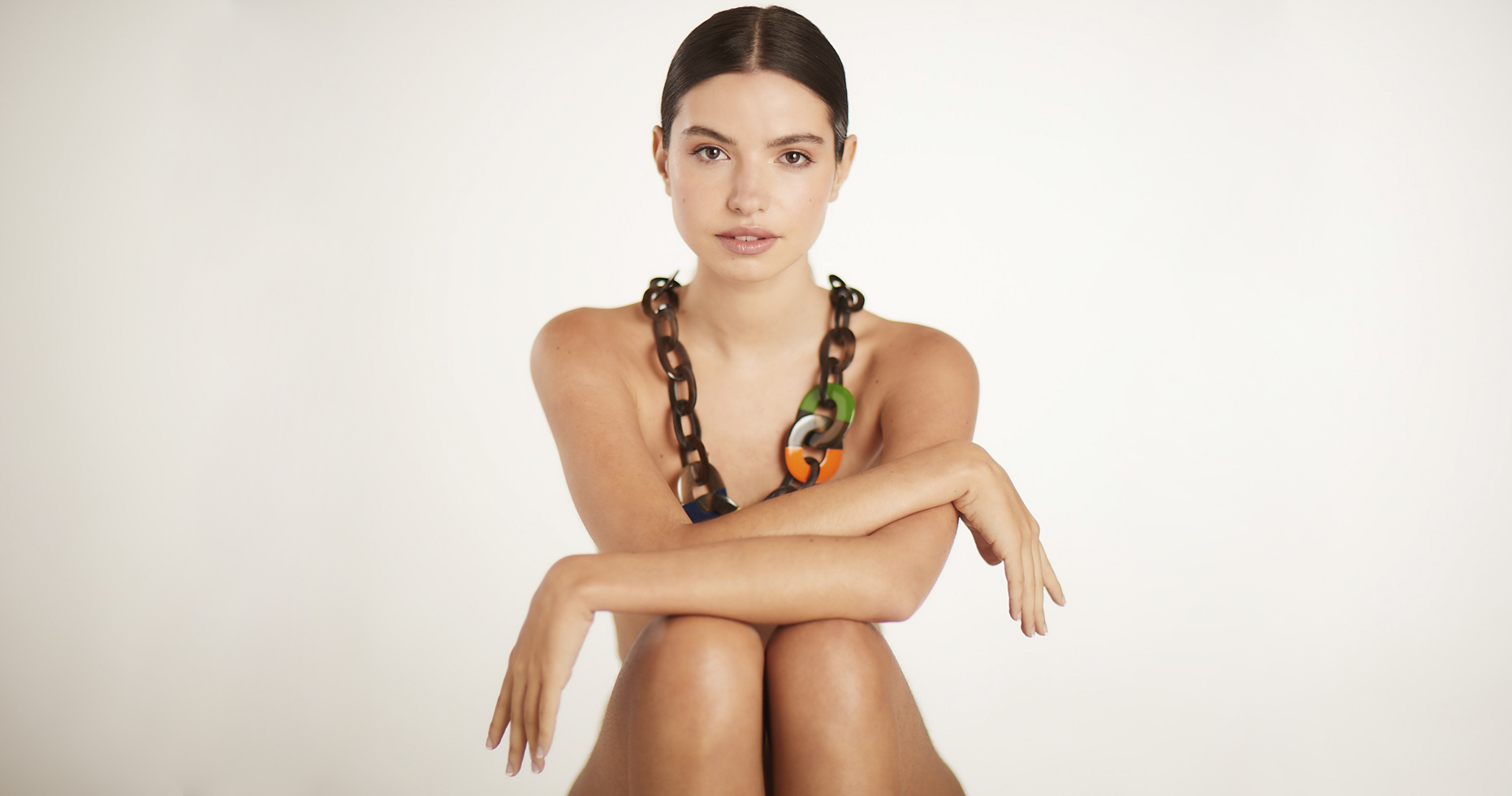
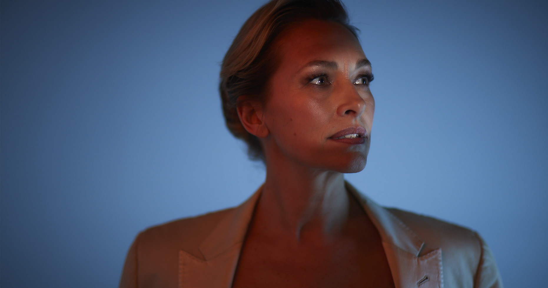
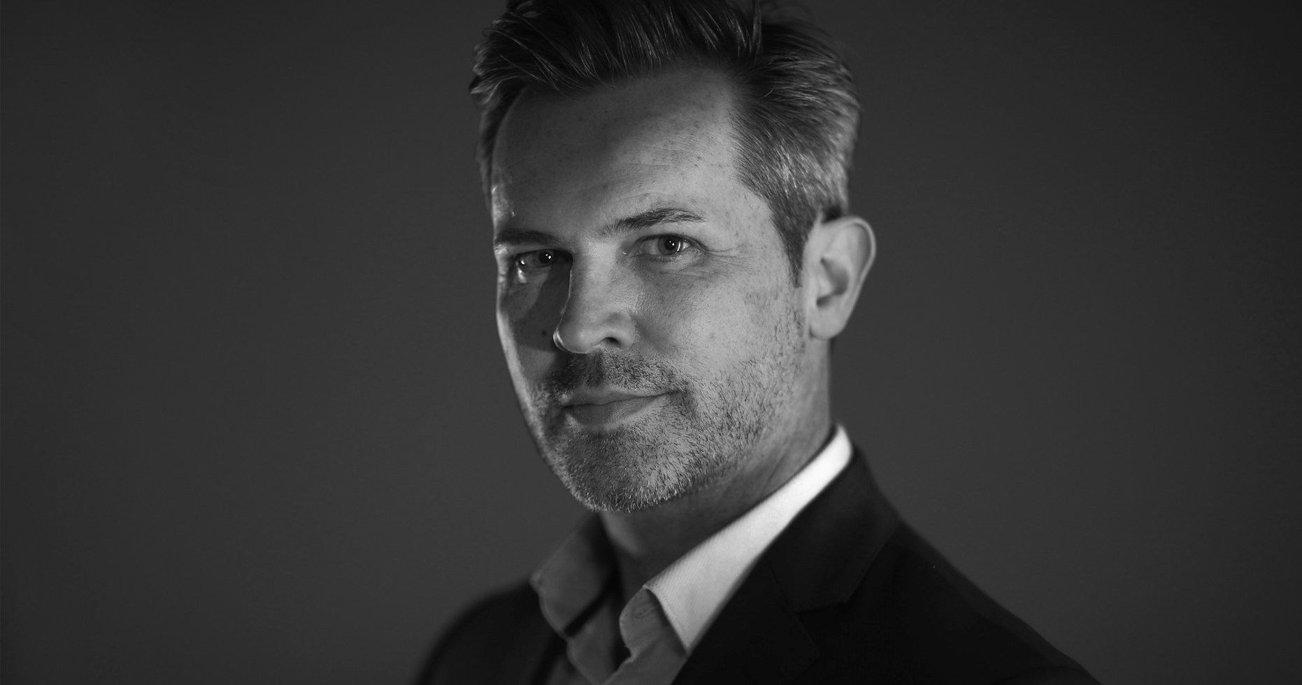
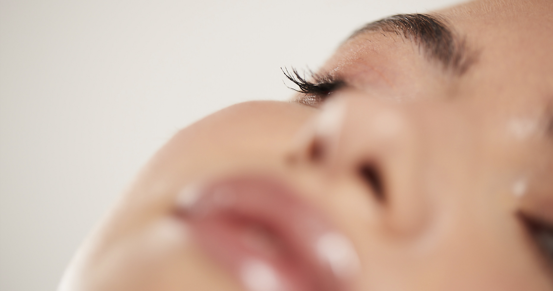
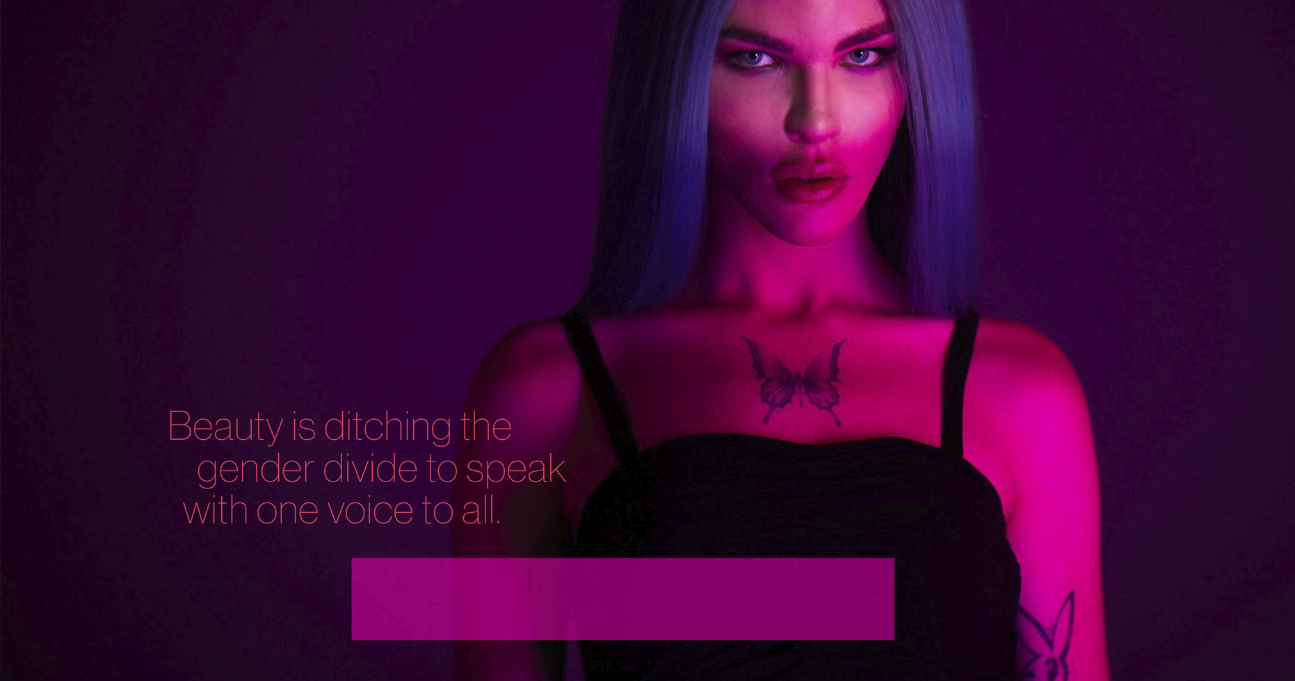
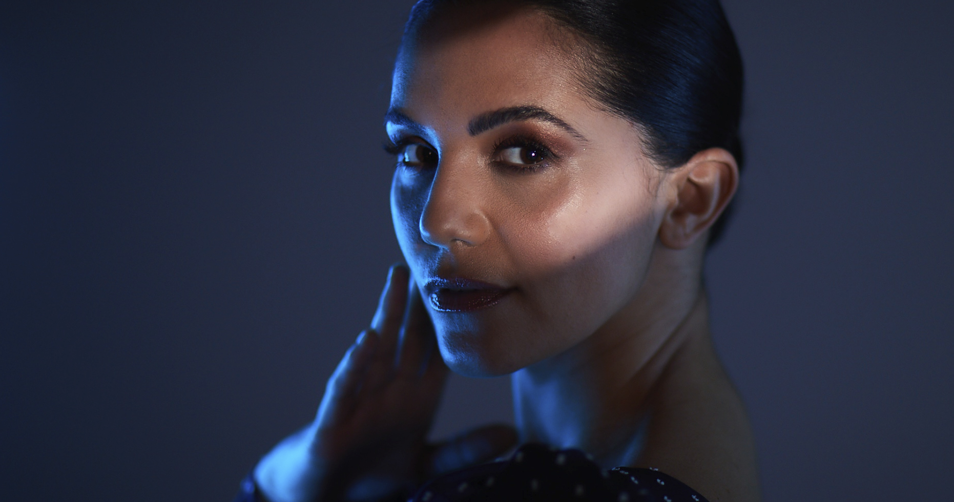
We built on the strategy by creating a suite of images and videos that would showcase the benefits of natural beauty. We designed two lighting states to communicate the two sides of us all, natural light to suggest the way we see ourselves in the mirror, and something a lot more dramatic, perhaps the way we want others to see us.
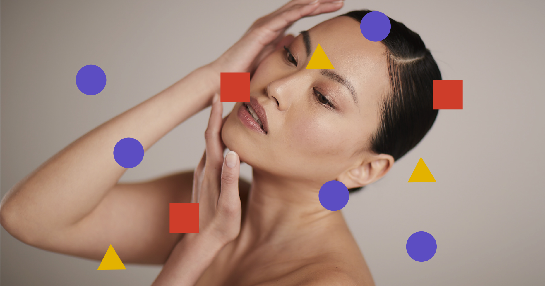
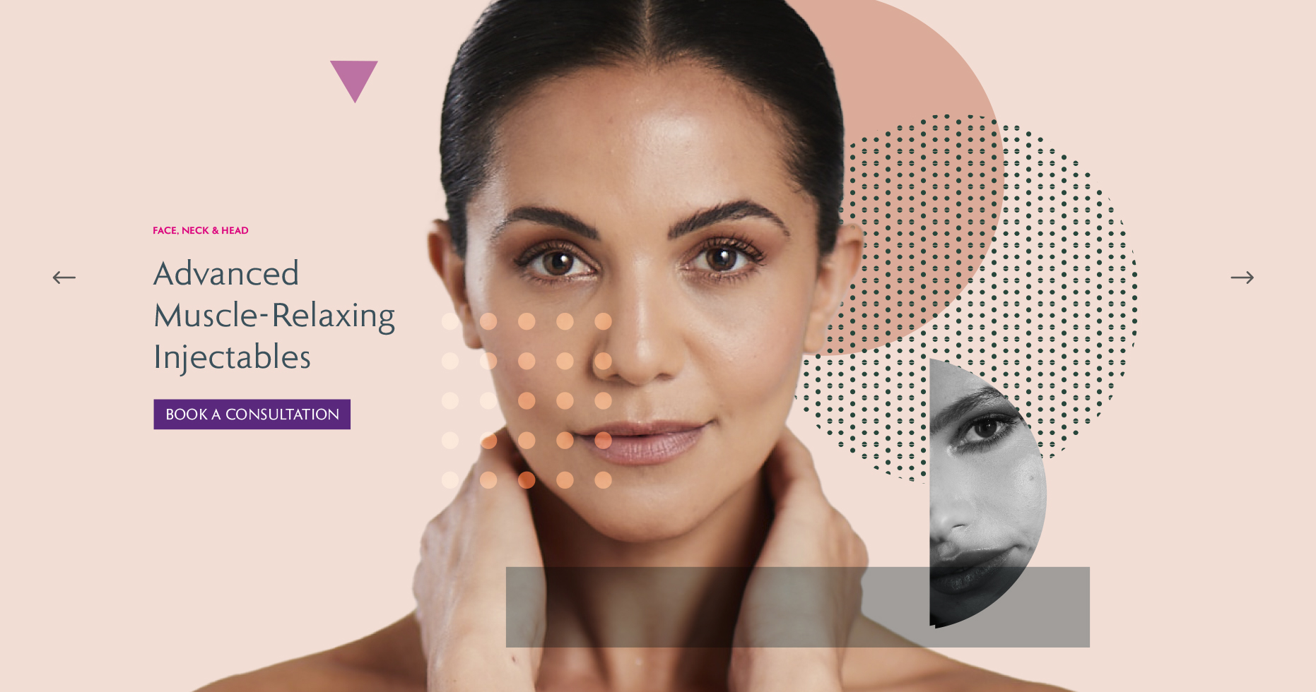
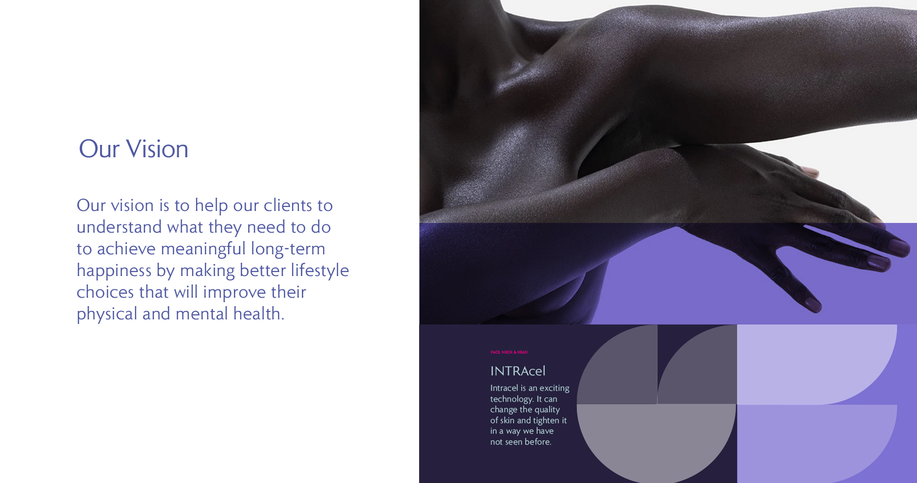
The overall design ethos was to represent the angles visually, adding graphic overlays to images and layouts to create a dynamic energy.
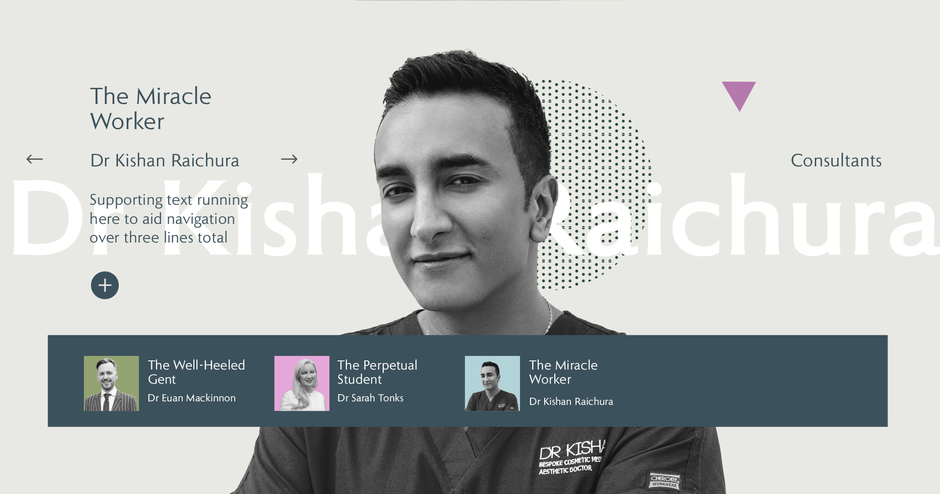
We incorporated the imagery, film and graphics into a website design that breaks away from the white clinical feel many others choose, and instead created something quirky, light-hearted and more forward thinking.
In association with Abacus Marketing.
Creative Direction Jay Flaxman. Photograpy by Chris Newton.